Survivor Portal
A platform to connect disaster survivors with first responders and their loved ones.
Overview
The survivor portal is an aid request and messaging platform that is accessed on survivor mobile phones. Survivors connect to "Eaton Emergency Network", a wifi signal broadcast by mesh nodes. The node serves a locally hosted web application that the survivor can use to fill out a needs form and compose messages to loved ones. The messages are then delivered by drone a few days later.
Survivor Portal Prototype
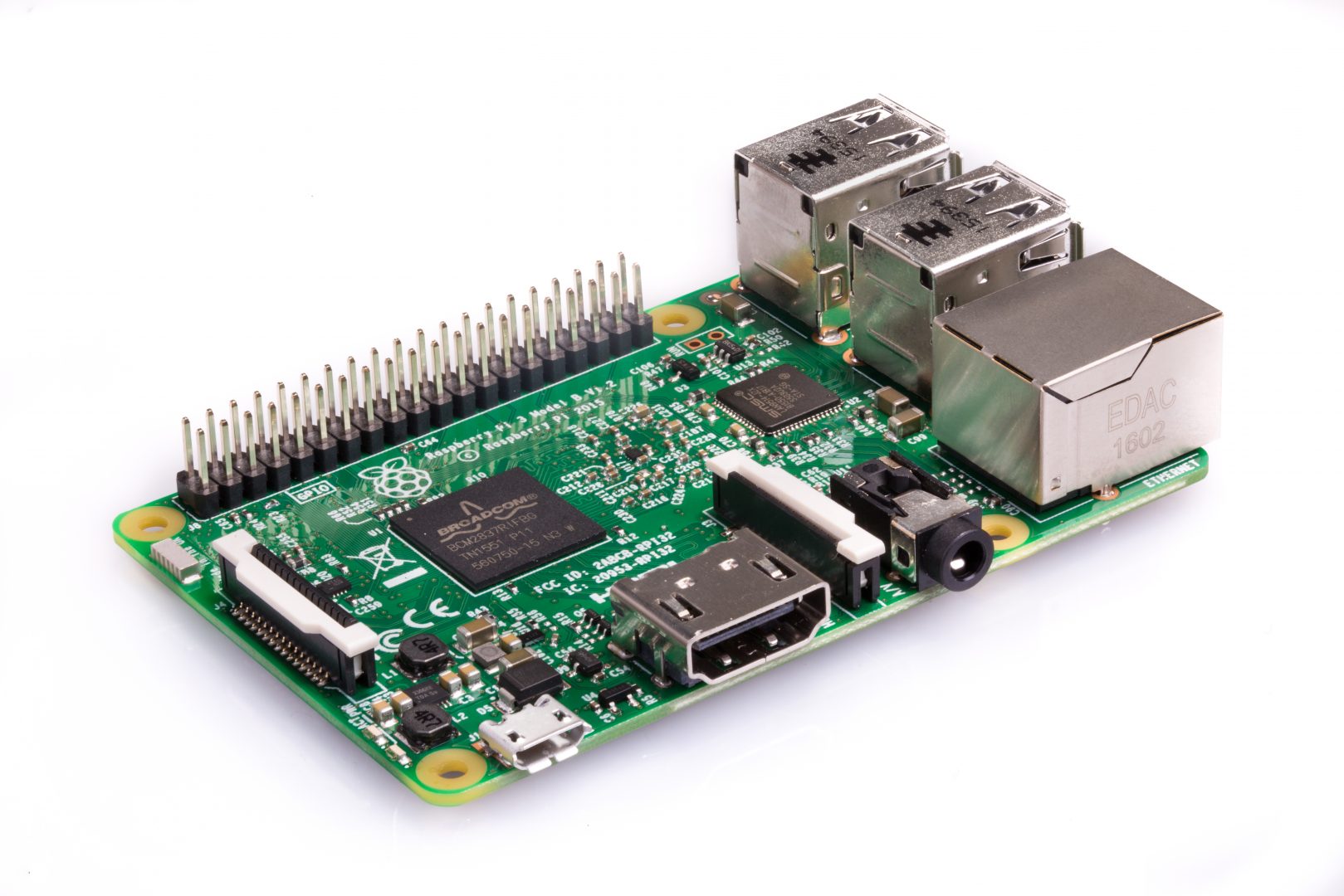
We designed a working prototype of the capitve portal. We used a Raspberry Pi to serve as a wifi hotspot and web server, and coded the web page using material design components.
Raspberry Pi as a Captive Portal
The ever-versatile Raspberry Pi served our hardware prototyping needs. We made use of this tutorial to enable the captive portal behavior. Instead of this tutorial's basic webpage, we embdedded the entire survivor portal flow into the captive portal window.
Walkthrough
To get a better sense of the prototype's functionality, we've recorded a walkthrough video. Note the captive portal screen that pops up at the beginning.
Survivor Portal Features
Through continuous testing, we have designed several key features in the survivor portal.
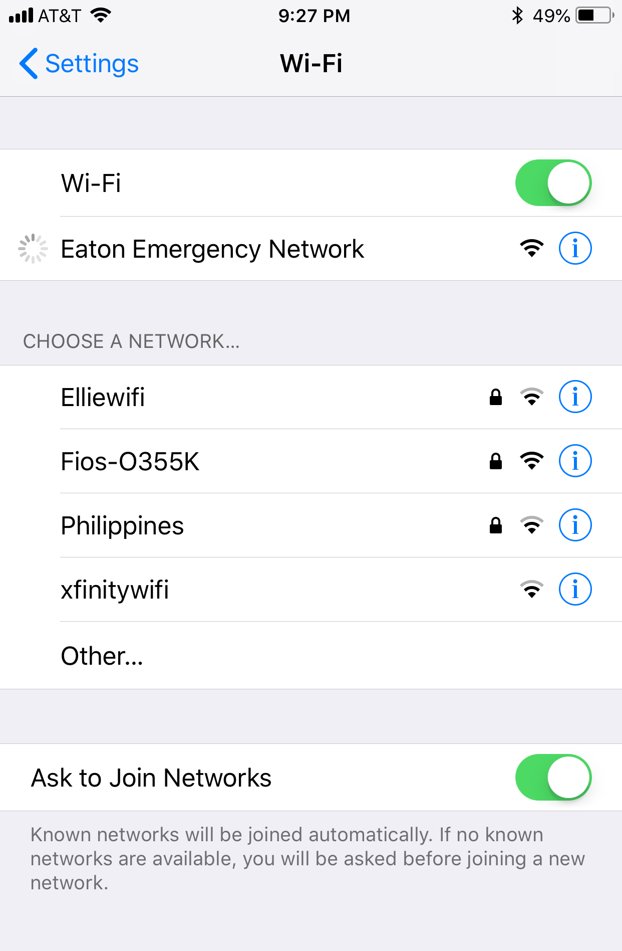
Captive Portal
The app is automatically shown when connecting to the network. We chose this instead of an app, as that would require pre-disaster planning. This is a low-power, low-commitment solution.
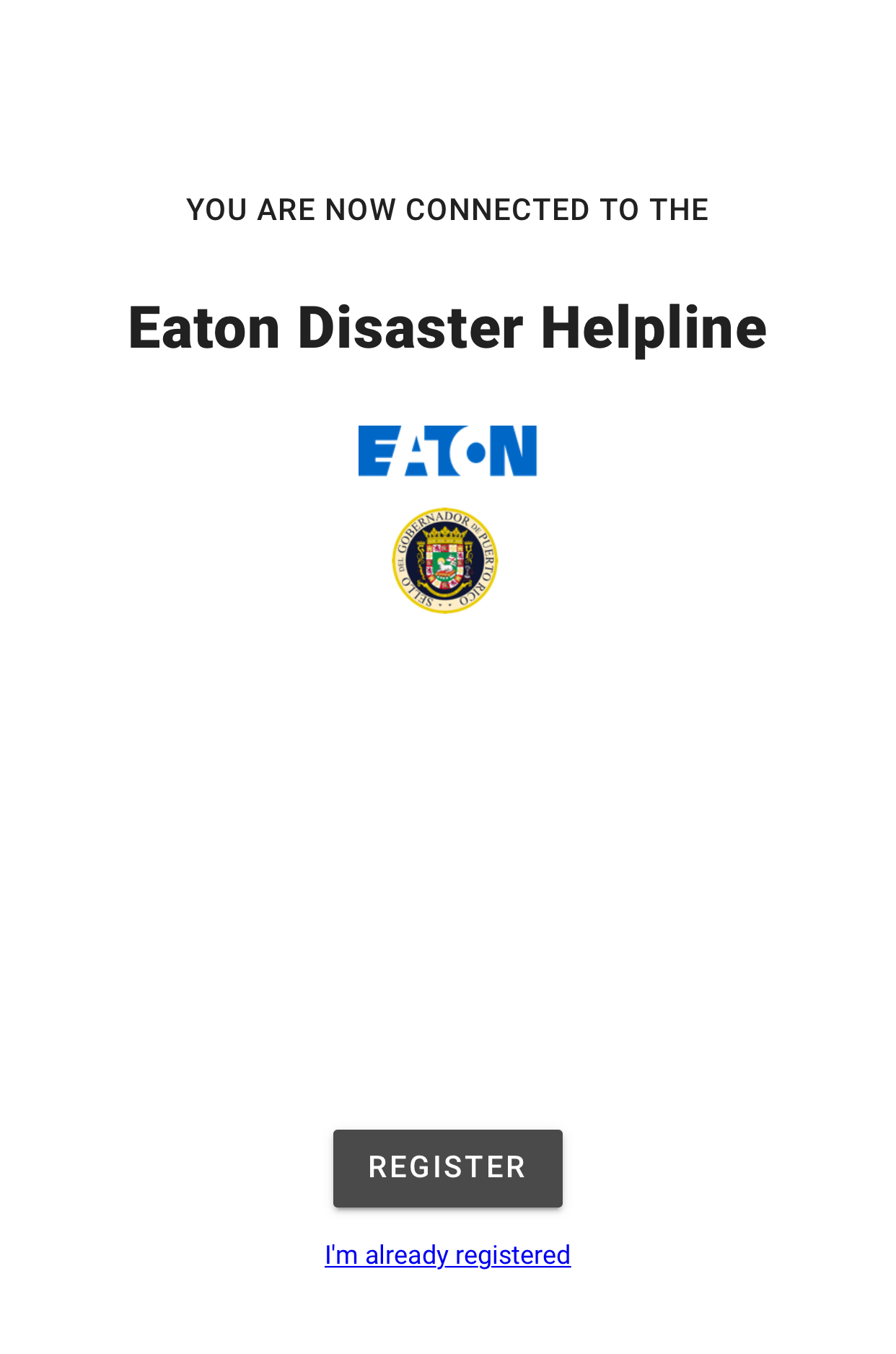
Landing Page
The landing page has logos of both Eaton and the local government to build trust with users. This also builds brand for Eaton. By clearly defining the action here, the page has a low cognitive load for users who may be in distress post-disaster.
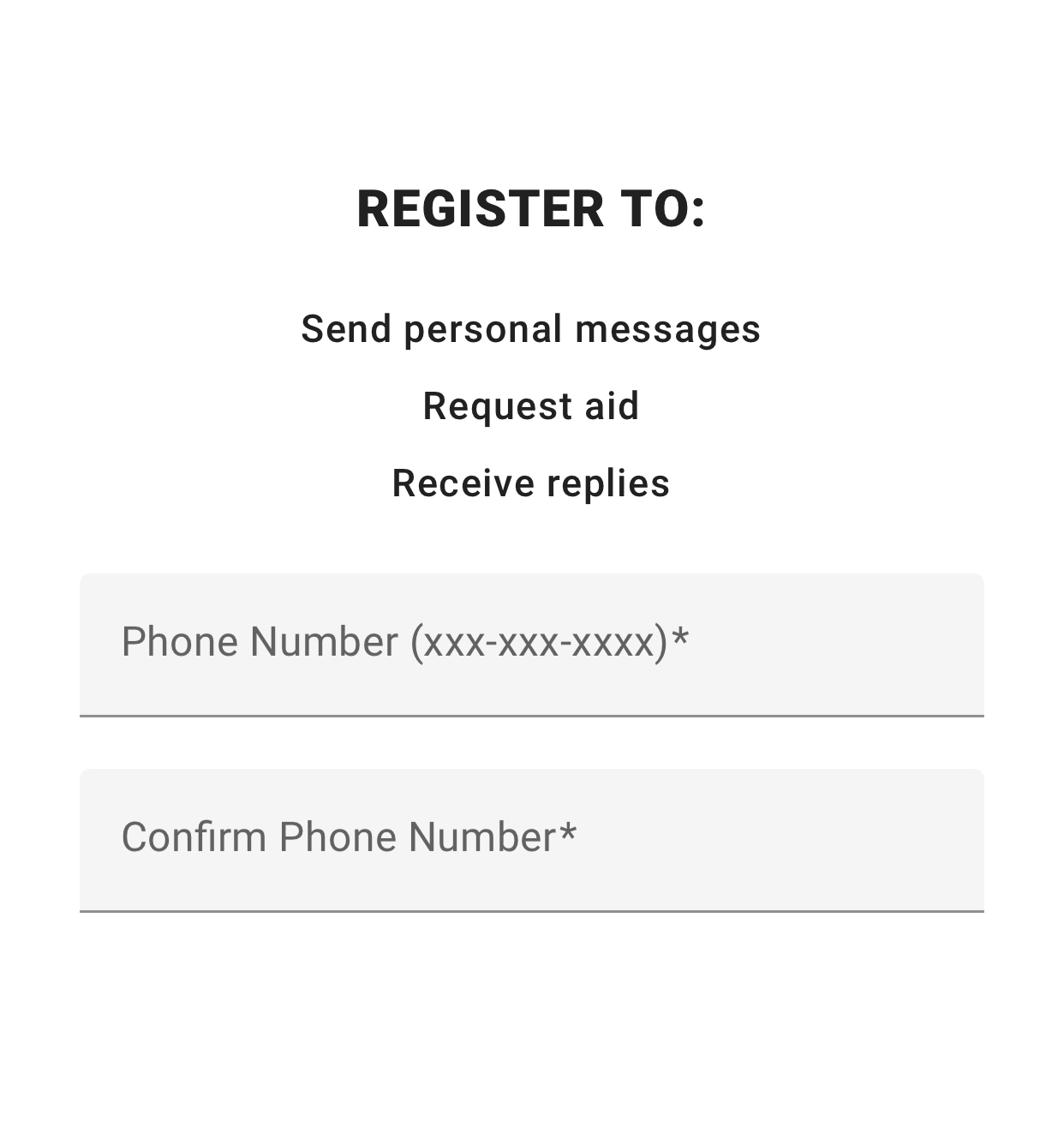
Registration
The purpose of the system is clearly stated on this page. Users enter a phone number as a unique identifier. There are no passwords, as they would add too much complexity to a stressful post-disaster situation.
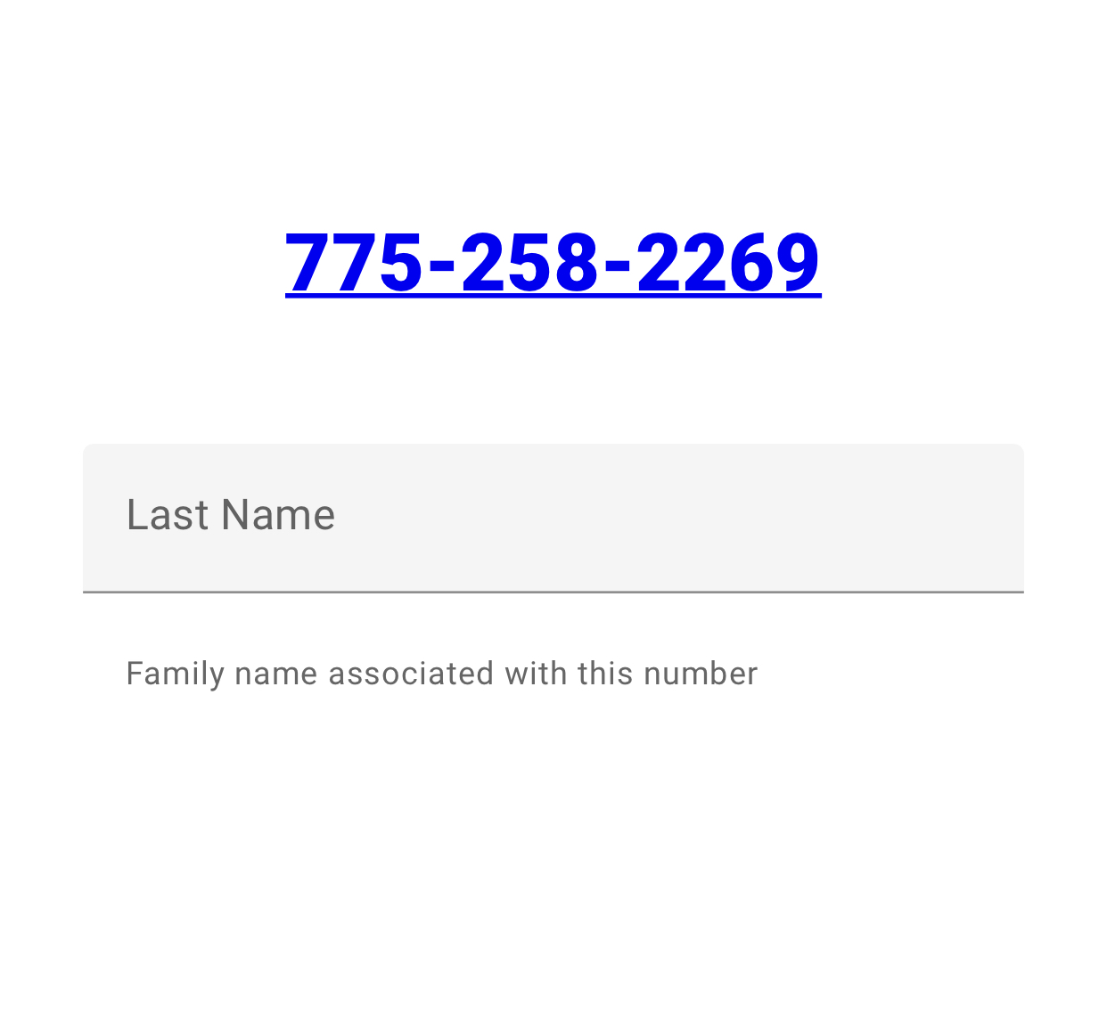
Family Name
This feature consolidates the number of potentially redundant responses by allowing users to register by surname, instead of individually. The page helps to inform users of the intended use of data.
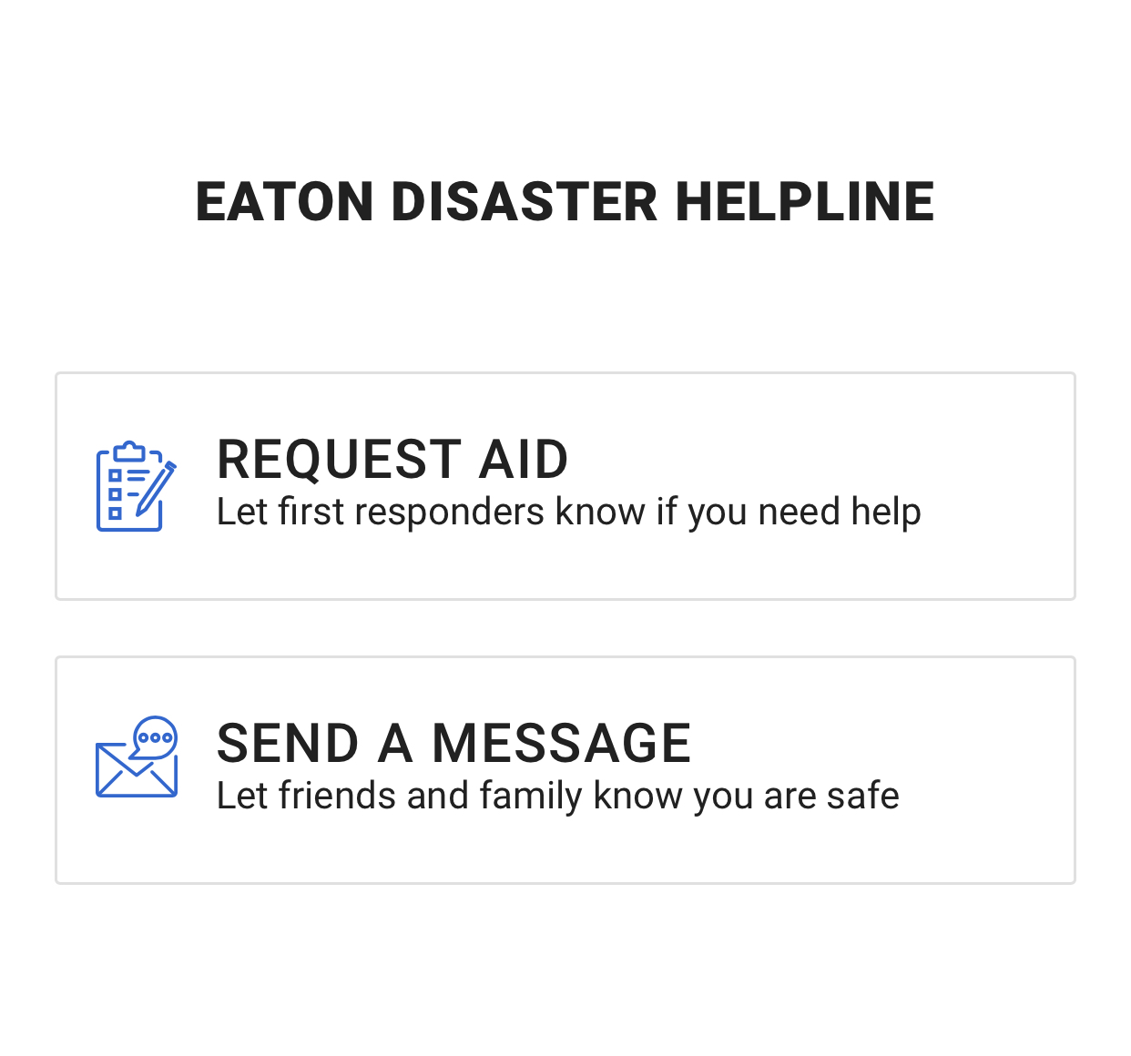
Choosing the Action
This page allows survivors to prioritize the action according to need. Survivors can either request aid or send messages to loved ones. We follow progressive disclosure of different concepts through this format.
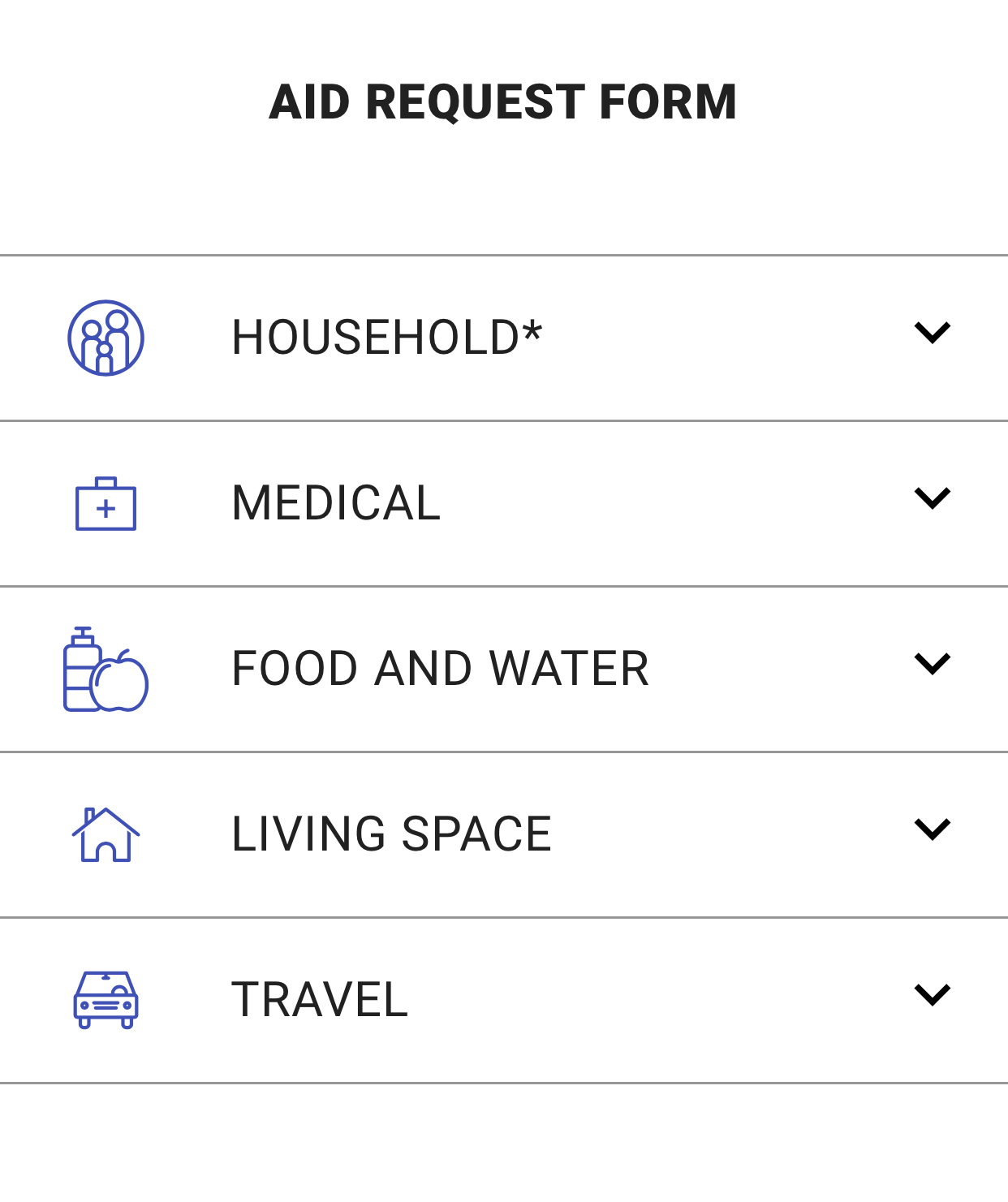
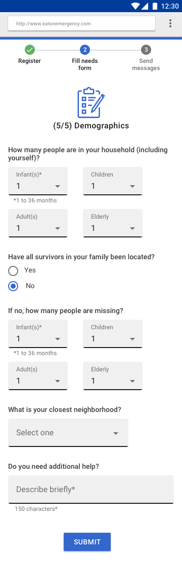
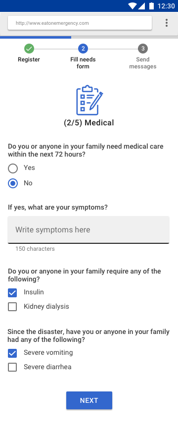
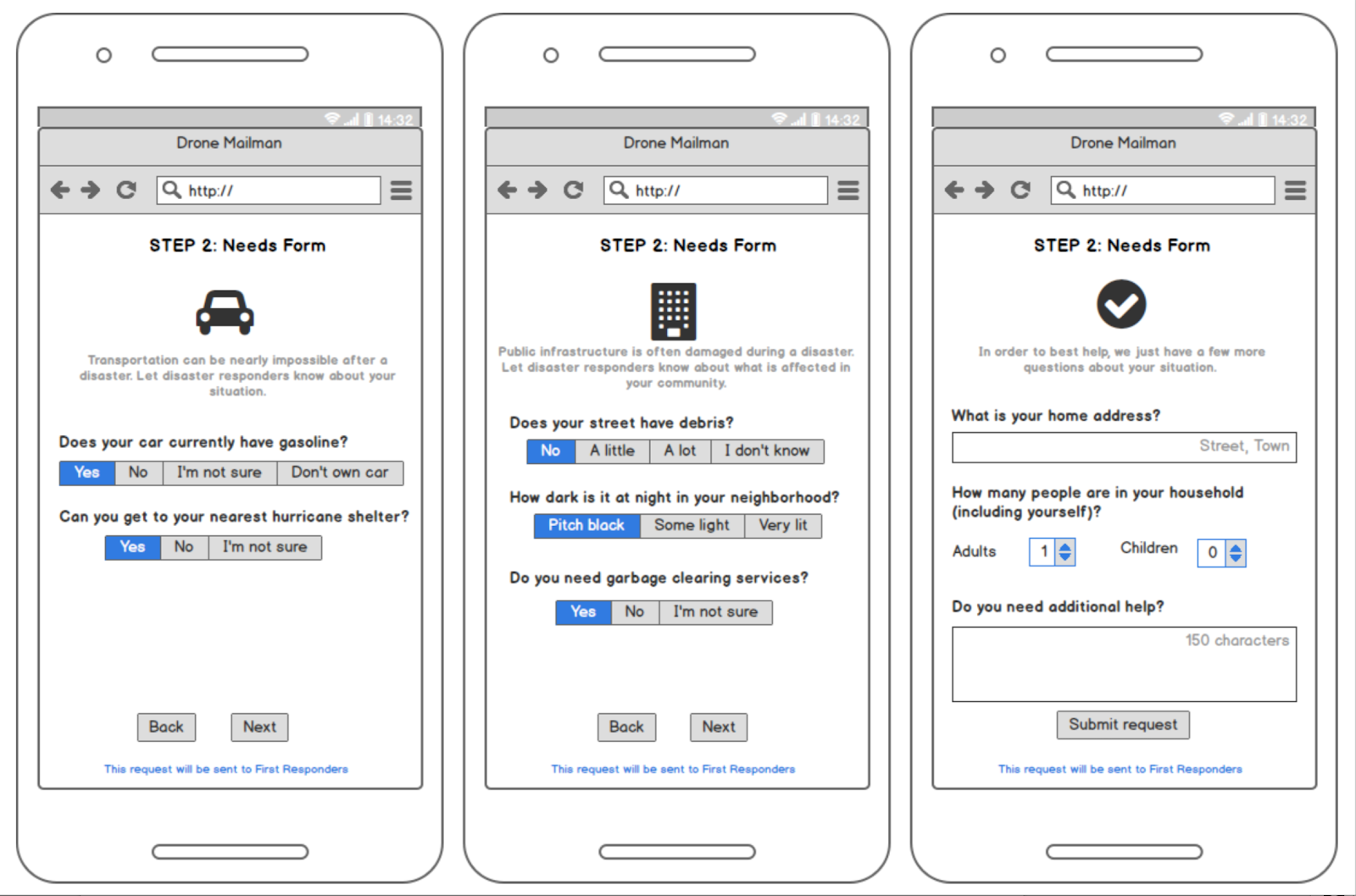
Aid Form
The aid form has five categories, divided by the mental model of average people. The household category is the only mandatory section. Questions are simple and situational, easily answerable by the average user.
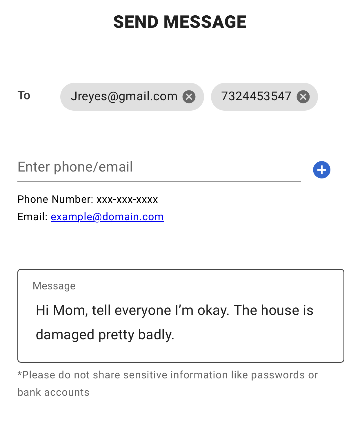
Sending Messages
One message can be sent to up to five different people. This feature accepts and validates emails and phone numbers, and reminds users with a disclaimer not to include private information such as passwords or bank account information.
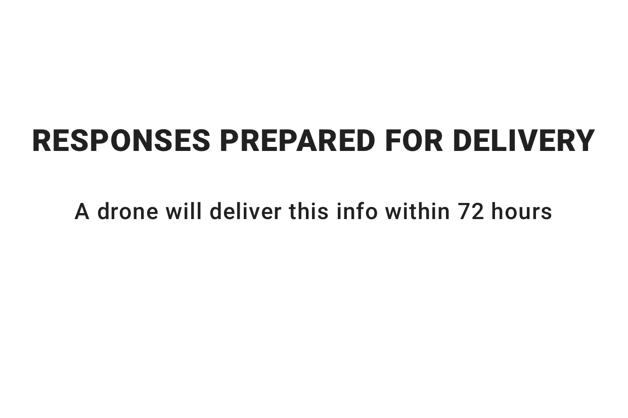
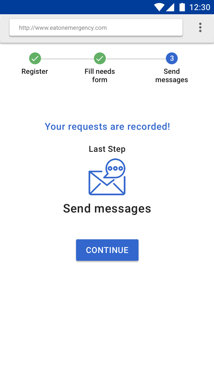
Submit Requests and Messages
The final step in this user flow is to submit requests and messages. A confirmation screen appears that messages will be delivered soon, and survivors can log back in later to view responses.
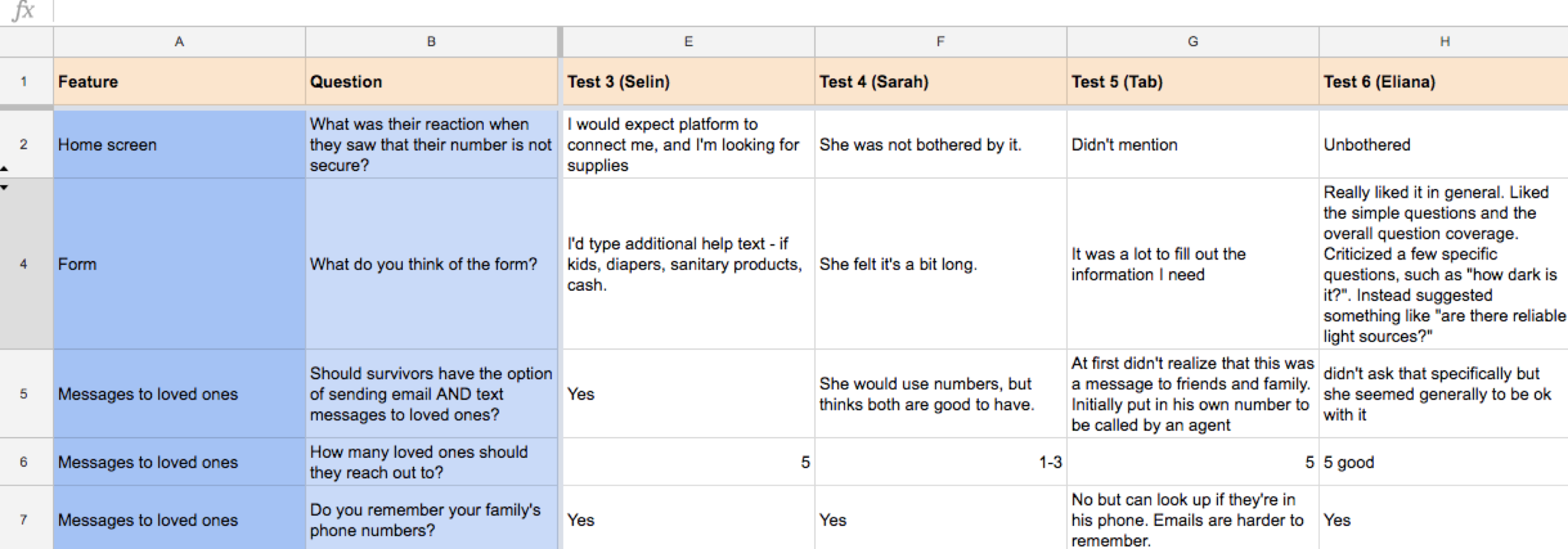
Usability Testing and Design Refinement
In order to refine our prototype, we tested each iteration of our design with both UX experts and disaster survivors. Standard questions were asked at each phase of design, which were measured by number of responses and intensity of response.
Lo-Fi Paper and Balsamiq Prototype
We began testing our design with low-fidelity paper prototypes to ensure the length of the tasks, form content, and other details worked with our users.
Measuring Usability Tests
We kept track of how different users responded to the same questions, in order to gauge the importance of each usability issue.
Inducing Stress in Participants
In order to mimic the reaction of real-life users after a disaster, we induced mild stress in our usability testing participants.
This included:
- Having participants watch YouTube videos of hurricanes and other disasters before testing
- Interrupting participants mid-task
- Making participants stand up and walk around mid-task
- Having participants memorize a set of random words and testing them later on these words mid-test
- Setting the stage by giving participants a persona to embody throughout the session
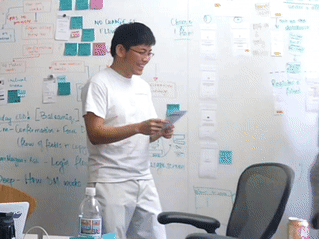
A usability tester, visibly stressed
Expert Interviews
As we wanted to make sure our aid request form captured relevant information and was useful and usable, we showed our form design and questions to a psychology professor here at Carnegie Mellon University and to disaster management experts.
We learned the following:
- Using simple language (i.e. frequently-used words) is important
- Responses should be multiple choice
- Users should be able to have a high-level understanding of the form prior to starting it
- Form should not be too long or detailed
Hi-Fi InVision Wireframes
As we continued to gather usability feedback, we moved to high-fidelity screens using Sketch and InVision.